The Art Direction for Chrome Switcher


Chrome Switcher is a color-switching parkour game all about navigating through levels utilizing various parkour abilities, such as wall jumping, sliding, and climbing.
For a while, I struggled with how exactly I wanted Chrome Switcher to look and how I wanted to present the overall theme and experience of the game to players. I decided to choose a retro/synthwave theme since I thought it fit well with the fast-paced parkour and color switching the game was all about. Another struggle I had was determining how to design the levels in a way where I can combine both of those ideas of parkour and disappearing objects through colors. I took inspiration from Assassins Creed and a level design article about parkour games. This was extremely helpful. I plan on devising a strategy/framework I can use to build levels that aren't repetitive, but fun for players.
So, I started to redesign the first three levels and got to work on the forth level (which isn't out yet, but will be soon ;))
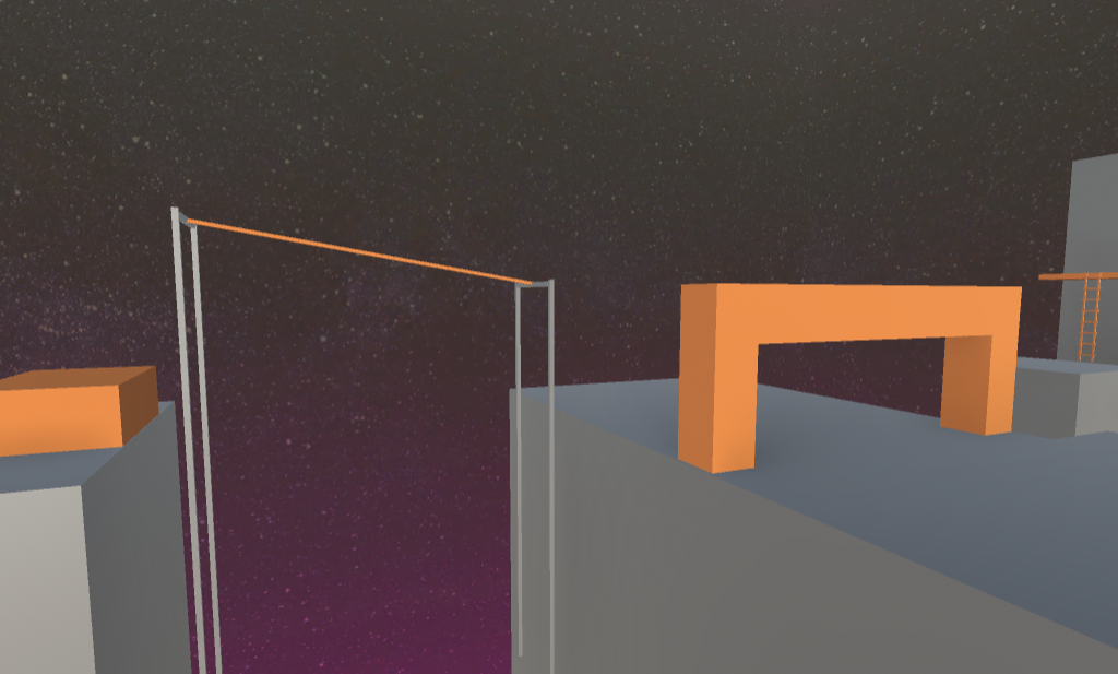
Level 3 Redesign

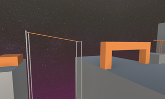
A part of level 4

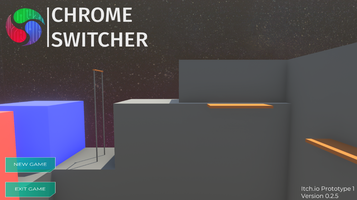
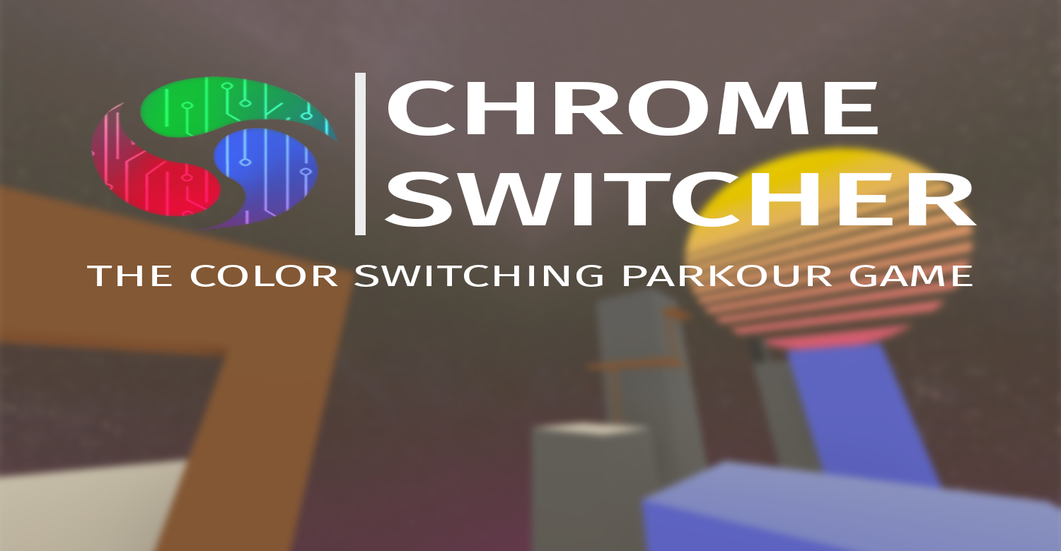
With this new art style, I had to change the main menu design as well. And thus I did:

Overall I'm pretty excited about this new direction for Chrome Switcher. I plan on completing at least 5 more levels by March 19th, so we can be at 10 levels overall. I also plan on starting a YouTube devlog series! So keep in touch by following Chrome Switcher :)
Files
Get Chrome Switcher
Chrome Switcher
A color switching puzzle-platform game.
| Status | Prototype |
| Author | Pixel Steel Games |
| Genre | Puzzle, Platformer |
| Tags | 3D, FPS, Parkour, Singleplayer |
More posts
- STEAM DEMO RELEASE! v1.0.0Apr 28, 2021
- Test Trailer and New Levels!Mar 15, 2021
- We're in the home stretch!Mar 11, 2021
- Chrome Switcher V0.2.1 - Camera and AnimationsMar 05, 2021
- THE PARKOUR UPDATE IS LIVE!Mar 04, 2021
- Parkour Update Week!Feb 28, 2021
- V0.1.3 is Now Live!Feb 26, 2021
- V0.1.3 - Bouncing Things and Level 3Feb 26, 2021
- V0.1.2 - Wall JumpingFeb 24, 2021

Leave a comment
Log in with itch.io to leave a comment.